
Background
The ‘Swiss’ or International school of typography emphasised clean-ness, readability and objectivity. Grids became the order of the day for layout and predominantly, sans-serif faces were used.
Adrian Frutiger and Albert Hollenstein, designers from Switzerland, found themselves working in Paris in the 1950s. Frutiger was especially dissatisfied with the serif-less faces then available, especially in the consistency between different fonts of the same typeface, for example the way the roman, bold and italic each worked together.
Deberny & Peignot
By the mid-1950s, the Paris typefounder Deberny & Peignot knew that the future did not lay in metal types.
Charles Peignot, in charge of the foundry made an agreement to sell the Lumitype (known elsewhere as the Photon), itself a French invention to use light and film to create originals for offset litho printing rather than metal types. Since the machines used photographic masters, individual characters could be enlarged, reduced, slanted and boldened.
Peignot now needed a superb face that could be cut in metal for his traditional business, and show off the capabilities of the Lumitype. Adrian Frutiger, art director at Deberny & Peignot since 1952 was asked to create a new face and the result was Univers.
Characteristics of Univers
Frutiger considered faces like Futura to have a weakness: their adherence to geometric forms compromised on readability.
A purely geometric character is unacceptable in the long run, for the horizontal lines appear thicker to the eye than the vertical ones; an O represented by a perfect circle strikes us as shapeless and has a disturbing effect on the word as a whole.
— Adrian Frutiger
Individual characters don’t slavishly have lines of the same width, there are minor changes to the width to enhance the horizontal flow of each line. This corrects an optical illusion where horizontal lines appear to have a greater weight than vertical lines.
Univers’ x-height is relatively large, and a very subtle width increase at the foot of some letters gives the impression the face is ‘holding’ on to the line. Figures for Univers are wider for their height than either Gill or Grotesque, again enhancing overall readability.
For any single variant of Univers, the impact is to give a very even ‘colour’ of pages — no awkward character design (compare Monotype Grotesque lower case ‘g’ with the Univers version) and well-considered spacing between characters means the eye is not drawn to particular parts of the type or spaces between characters.


Rational Variant Naming
A further innovation was to dispense with the usual wording to describe each variant of the face — roman, italic, condensed, expanded — and replace this with a rational system.
On the matrix of fonts —
- Rows represent the weight of the face, the lightest at the top and heaviest at the bottom. This is the first digit of the reference: starting with 3x for the lightest and 8x for the heaviest.
- Columns represent the width of each face, the most expanded being on the left, and narrowest on the right. These carry an odd number reference for roman weights and even numbers for italic. x3 being the widest face and x9 being the narrowest. Within this range x6 and x8 are the italics.

This unusual and logical system means that further variants can be imagined — a very heavy, but very condensed italic would carry a reference of 88, for example.
Two problems arose, though, from this. As printers took delivery of Univers, it sat in cases that were partners to Gill, Grotesque and other sans-serif faces. Printers simply added their own naming to make sense of the new faces in the context of what was already in the case room. Similarly, UK typefounders tried to attach names to the variants, so Mouldtype offered ‘Univers Medium Extra Condensed’, and Bold, Extra Bold and Ultra Bold versions of faces.
Secondly, Monotype decided to maintain their strict sequential numbering of their references, so Univers Bold Condensed Italic, (Frutiger reference 68) was Monotype reference 694-I while the next highest in Frutiger’s series (Bold Expanded, reference 73) was Monotype reference 692.
Thus, a worthy attempt to bring order to the chaotic designation of type weights and widths was allowed to fail.
Alexander Lawson in Anatomy of a Typeface
Other Serif-less Types
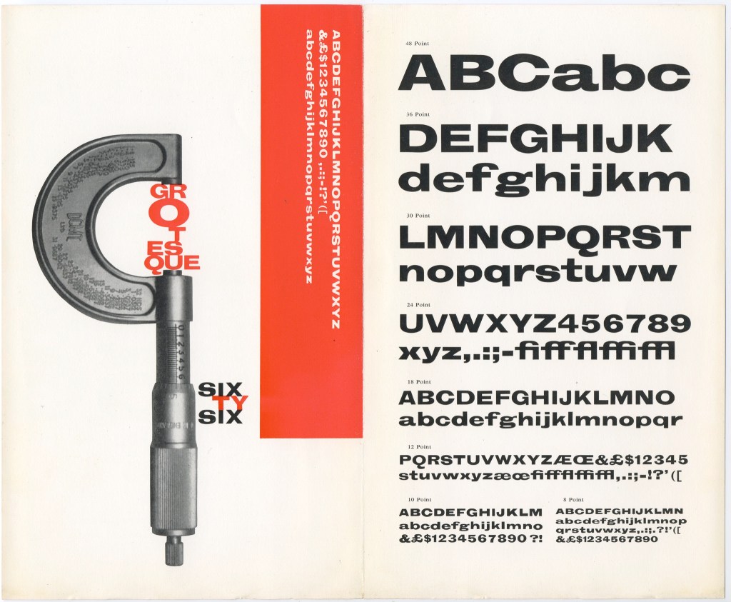
Univers was not the only serif-less face hitting the market in the late 1950s. Mercator was offered by Typefoundy Amsterdam, Folio by Bauer in Germany, and Neue Haas-Grotesk by Haas’sche foundry, of Basel, all in 1957.
In 1958, Nebilo of Italy issued Recta, designed by Aldo Novarase.
Industry Response
Monotype was planning to reinvigorate their line of Grotesques, but when presented with Frutiger’s design, John Dreyfus of Monotype agreed that they should offer Univers. The sheer variety of the 21 styles meant that this exercise had a material impact on Monotype’s overall production of matrices, but the outcome was the most successful Monotype face issued since World War II.
Stephenson, Blake were in a more difficult position. They had realised that they were unable to invest in designing their own face from scratch, or buying a face from another founder to cast in their own works. They needed a refreshed serif-less offering, and knew that when those were being offered by the industry they usually included mechanical composition (through Linotype/Intertype and Monotype) and photographic composition as well.
They chose to re-issue some of their older grotesque faces and set to work on their own offerings. Impact and Adonis were amongst the last faces issued by Stephenson Blake in metal. Impact was designed by Geoffrey Lee and issued in 1965. Andre Cretton had designed Adonis for photocomposition by Typefoundry Amsterdam in 1962, and the design was bought by SB to issue in metal in 1971.
![SB Adonis Bold : leaflet & specimen sheet issued by Stephenson Blake & Co Ltd, Caslon Letter Foundry, Sheffield, Yorkshire : nd [c.1961] : Adonis Bold](https://live.staticflickr.com/65535/52336463346_7e8f4c25b6_c.jpg)
Year and Era
1957 / Modern
Object Type
Types and Casting
Location
Address of Deberny & Peignot, 18 rue Ferrus, Paris 14 foundry that commissioned Univers.
Sources and More Information
- Dreyfus, John, Univers In Action, Penrose Annual, 1961
- Lawson, Alexander, Anatomy of a Typeface
- Monotype, Monotype Composition Faces
- Millington, Roy; Stephenson, Blake, Last of the Old English Type Founders
An Appeal
If you have something linked to this object, please get in touch.
Header Image: “Univers, divertissements typographiques” flickr photo by Ampersand Press Lab https://flickr.com/photos/ampersandpresslab/49925207018 shared under a Creative Commons (BY-NC) license
